

 |
 |
 | ||||||||||||||||||

Four copies of The Practical Surveyor were referenced before reprinting the book. One of these copies was from a microfilm in the New York State Library. This had some unevenness in the print quality and some of the lines of text were not straight. When a physical copy of the book was examined in the Boston Public Library, it was found that almost all of this variation was due to shrinking and swelling in the paper, not in the original print quality. The original print quality was equal to that of today, with crisp letters and clear lines and woodcuts.
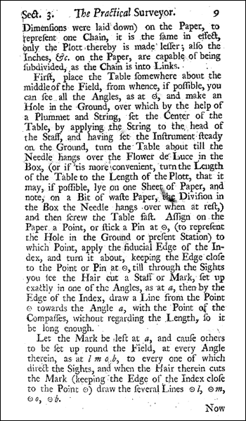
The figure to the right is scanned from a photo-duplication of a microfilm version of the book. This is the format that was used for the bulk of the reproduction, though it was not used directly.
There are several different techniques that can be used to reprint old books. Some books are reproduced using photographic reproductions of each page. This has the drawback that any expansion or contraction of the paper affects the alignment of the text in the reprint. Any yellowing of the paper or fading of the ink shows up as well. For example, there are smudges and misalignments in the page to the right. A second technique is to reprint the contents using modern fonts, spelling, and layout. This loses some of the flavor of the work. Rather than use either of these techniques, this reprint of Samuel Wyld's The Practical Surveyor uses the same basic pagination and font as the original, but set using modern electronic techniques to produce clean and sharp printing.
Although the tables have been redrawn, the overall formatting is very close to the original. This includes an end word on each page which duplicates the first word on the next page (see also an excerpt from Chapter 5 in PDF format). Font sizes and, on average, font spacings are also identical to the original.
A majority of English and American books that were published between the early 18th century through 1800 are set with the Caslon font. A specific computerized version of the Caslon font was developed for the printing of The Practical Surveyor so that it would best match the font used in the original text. The spacing of the computer font was adjusted to have the best overall match with the book.
In the late 18th century, there were three styles of the Caslon font in use: roman, italic, and swash. The swash style is essentially a fancy version of italic, with extra curls to the serifs and other ornamentation. In The Practical Surveyor, most of the italic text is regular italic, but there are a few letters (such as the capital Y) which always appear in the swash style. It may be that there was only one italic style at this time and a swash style had not been developed. This could also have been a preference of the printer.
Ligatures and long s characters are used throughout. A ligature is when a special joined set of characters is used in placed of two or more separate characters. As an example, see the joined 'ct' in the word 'Practical' at the top of the page. The long s character (which to modern sensibilities looks like the letter f) is used everywhere except at the end of words, immediately after or before an f, or immediately before b, k, or an apostrophe.
In some places the font used in the book is looser than the modern font, in other places it is narrower. This results in the reprint having a very similar, but not quite identical, format to the original book. All sections begin on the corresponding page as in the original, but often a few words are shifted from their original lines, and in places a line may be shifted to a preceding or following page.
More information on fonts and ligatures is provided in a short paper on the topic.
Analyzing the original text reveals that two, or possibly three, different people typeset the original. Each typesetter appears to have worked on a chapter at a time. One of the typesetters used relatively large spaces between words, preferring to move a word to the next line and increase the spacing to justify the previous line. The second typesetter preferred to jam as many words as possible on a line, sometimes shrinking the spaces between the words. It is possible that a third typesetter worked on the Preface, since this has even looser spacing. It is also possible that this was done so that the Preface would fill an odd number of pages.
It is also clear that the typesetter was not familiar with the notation of degrees and minutes. As an example, consider the quantity of 54 degrees 32 minutes. The modern notation of 54° 32' was in use at this time. However, at least one of the typesetters didn't know what this meant and copied from Mr. Wyld's original notes as best possible. This occasionally results in notation such as 5°4 3'2. The original notation has been preserved in the reprint.
Woodcuts were used to add mortises and header graphics to the original text. Copper plates were used to print six fold-out plates of figures that were added before and after the main text block of the book.
The original woodcuts are slightly blurred, as if the ink runs more when printing them than when printing the text. The original copper plates are very clear with exceptionally fine lines. To reproduce both the woodcuts and copper plates, a photo-duplication of a microfilm version of the book was scanned, then manually cleaned. This produces something close to the original quality of the woodcuts, but regretfully blurs the copper plates.
The original copies of the book have an approximate page size of 5.25 x 9 inches. The six plates of figures are each 11.25 x 9 inches and z-folded into the book with the printing facing the bulk of the text. All of the pages of the reprint are 6 x 9 inches, with wider margins to the left and right of each page. For four of the plates of figures, all of the information fits on one 6 x 9 inch page. The other two plates are split across two pages.
The original copies of The Practical Surveyor have a sewn binding, bound into a handsome leather case. For the specimen examined in the Boston Public Library, the case was plain except for a raised spine and a raised rectangle on the front. The raised areas were gilded, including a title and the author's name on the spine. There was no text on the front.
The reprint is a trade paperback with a perfect binding. A perfect binding is a form of glue binding where the pages are cut flush and then glued.
The Practical Surveyor · by Samuel Wyld · with Notes by David Manthey
ISBN 1-931468-06-0 · Copyright © 2001 by David Manthey ·
6x9", 244 pages.
[ Overview |
Contents |
Excerpt |
Cover |
Typesetting |
Research |
Order |
Publisher |
Contact ]
[ Flower-de-Luce Books |
Invisible College Press |
Orbital Central ]